

Mitteleuropa and Bethnal Green, 1946
[click on image to enlarge]
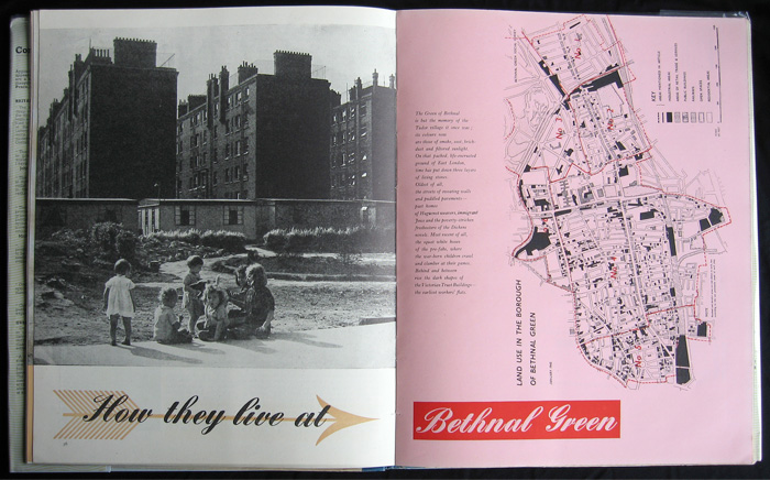
‘Most recent of all, the squat white boxes of the pre-fabs, where the war-born children crawl and clamber at their games. Behind and between rise the dark shapes of the Victoria Trust buildings, the earliest workers’ flats.’
These are the opening pages of Ruth Glass and Maureen Frenkel’s article ‘How they live at Bethnal Green’, in the second volume of Contact, a magazine-like-book series launched in Spring of 1946.
Bethnal Green was one of the poorest metropolitan boroughs: ‘89 per cent of all households have no bathroom. The only source of hot water for 78 per cent of all households is boiling a kettle on the kitchen range or stove.’ The blitz had cleared some slums: ‘Whole streets were knocked out. Everywhere there are derelict sites which already seem to be part of this scene of urban decay.’ (The Victoria County History tells us that bombing killed 555 of the borough’s people and seriously injured 400; 21,700 houses were hit – 2233 destroyed, 893 uninhabitable, and 2457 seriously damaged.) But, Glass’s survey concluded, Bethnal Green’s outstanding feature was social cohesion: ‘however aged, poor, and shabby, it has solved one of the urgent problems of modern planning: how to create an urban community, the component parts of which are clearly distinct and yet integrated into a coherent whole.’ This article appeared seven years before Michael Young (who had drafted Labour’s 1945 election manifesto and in 1946 was directing its research department) established with Peter Willmott the Institute of Community Studies in the borough; in 1957 they published Family and kinship in East London.
The urban sociologist Ruth Glass, née Lazarus (1912–90), had left her birthplace, Berlin, in 1932. From 1943 she did two social surveys for the Association for Planning and Regional Reconstruction: of Bethnal Green 1943–5, and of Middlesbrough 1944–6. In the introduction to her 1948 book The social background of a plan: a study of Middlesbrough, she wrote that ‘the social context of town planning still has to be explored; the contribution of social surveys to local planning schemes still has to be defined’. The coinage ‘gentrification’ is hers, from a decade later. (I know nothing about her co-author Maureen Frenkel, who may have been an investigator for the Bethnal Green survey.)
The 15 photos which illustrated the article were by Erich Auerbach (1911–77) – not the author of Mimesis but a professional photographer born in the Sudetenland who, from Prague, specialized in musical performers and performances. In 1939 he left for London, and at the end of the war got employment as cameraman with the weekly Illustrated, while doing freelance work like this job for Contact in Bethnal Green.
In Auerbach’s photograph the long horizontal line of the prefab roofs bisect the old tenements. Under the Temporary Housing Programme of 1944–9, over 155,000 homes were built in Britain. ‘Prefab’ stood for them all, in fact a dozen different types of factory-prefabricated houses, from complete and finished kits to system-built structures to which cladding was attached on site. The most numerous – 55,000 – was the Aluminium Bungalow (B2) developed by the Aircraft Industries Organization for Housing, and the first to be wholly manufactured on a production line. There was a shortage of steel but plentiful aluminium; factories which had once made aircraft were converted to the production of roofs, cupboards, and sinks. The LCC’s first prefabs in East London were erected just off the Bethnal Green Road, and 5,000 people there were soon in temporary housing, ‘tin can homes’ for which affection often grew.
Contact aspired to a readership of what the New York Times, in an approving review, called the ‘managerial class’. To some critics it was aping Fortune, just as Picture Post had mimicked Life. Either way, it got up George Orwell’s nose: ‘the kind of streamlined, high-powered, slickly got-up, semi-intellectual magazine which you are familiar with in the USA, now beginning to appear here also’, he wrote in his ‘London letter’ for Partisan Review that summer, also lobbing a financial smear. Contact’s publisher and editor George Weidenfeld, alumnus of the Isle of Man internment camp for enemy aliens and self-described as an ‘excitable flamboyant Austrian émigré’, reckoned this sour grapes because he had turned down Orwell’s essay on ‘Politics and the English language’, which Cyril Connolly instead published in Horizon. Weidenfeld (b. 1919) had arrived in England from Vienna in 1938, and had worked for the BBC Overseas Service after his Manx sojourn. Contact, his first publishing venture, was joined by Nigel Nicholson in 1947.
One can imagine Contact’s relative ostentation – bread rationing was announced two months after its launch at the Savoy – offending Orwell’s penny-plain puritanism. ‘Streamlined ... slickly got-up’: that was the hand of F. H. K. Henrion, its first ‘art editor’, his sequences of double page-spreads designed for visual impact, with dramatically cut and cropped photos and contrasts in tone and scale. On the page in the picture below, Henrion made a montage from one of Cruikshank’s Oliver Twist cuts and an Auerbach photo, imaginatively misplacing the Artful Dodger from Dickens’s topography of Saffron Hill and the Farringdon Road. The idea for this juxtaposition probably came from a Contact editor, perhaps Frame Smith, who would also have supplied the captions to the pictures. The method and inspiration was that of another émigré and ex-internee: the Berliner John Heartfield, then living in friends’ houses in North London and scraping for work.
Henrion (1914–1990), the fourth central European émigré in this story, was born in Nuremberg to Franco-German parents. After six months on Man he had designed exhibitions and posters for the Ministry of Information, among others, and in 1946 worked on the ‘Britain can make it’ exhibition at the V&A. After the war he changed shape from commercial artist to designer, this signified by a shift from personal signature – ‘Henrion’ – to business name, Henrion Associates. He was a name-changer anyway: F. H. K. then stood for Frederick Henri Kay, but formerly it had been Heinrich Fritz Kohn, and Friedrich Heinrich Köhn, and Frederic Heine K.
The first Contact Books cost 3s 6d, equivalent to around £10 today, though soon went up to 5s. Called books and dressed in stiff covers to avoid paper and print restrictions on new periodicals, they had the editorial and visual character of magazines – miscellany of content, highly illustrated, large format, 96 pages of editorial sandwiched between two 16-page sections of adverts – and a projecting hand of ‘design’ which was new and, for some like Orwell, unwelcome. But Contact’s contributors were more impressive than his aside might suggest: they included Clive Bell, Elizabeth Bowen, Hugh Casson, Basil Davidson, Isaac Deutscher, Patrick Leigh-Fermor, Kingsley Martin, V. S. Pritchett, Stephen Spender, Philip Toynbee, Solly Zuckerman, and Mass-Observation.
This report on Bethnal Green written by a sociologist from Berlin was given visual material form by a photographer from Prague, an editor from Vienna, and a designer from Nuremberg. In London in 1946 that was not unusual. An admired post-war topographic series, ‘Vision of England’, was published by another émigré, Paul Elek from Budapest. And there are more stories like this.
Paul Stiff

[click on image to enlarge]